i had a somewhat intelligent intro to this post thought out, and then i remembered that i had to clean my mouth guard before practice tomorrow, and in the ensuing moments from table to bag to pot of boiling water, I forgot what it was.
in any case, it had to do with leaving your mark in places. i left one in the MPP lab with our Policy Gladiators poster and more recently with the Red Deer Rollercops Reffing Crew logo. these aren’t things that will last forever, but to a number of people at least they’ll serve as reminders of good times.
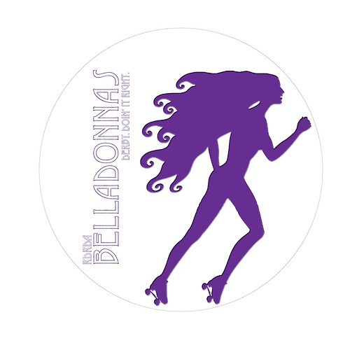
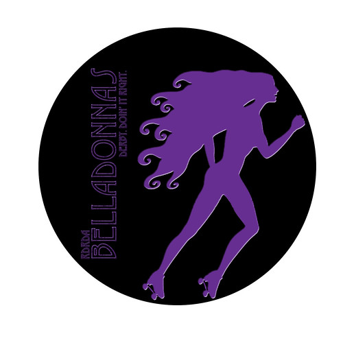
so that brings me to this; the new logo i did up for the Belladonnas. there’s absolutely no guarantee that it will be used as a new logo, but i’m fairly certain that it has a good shot of being used in some capacity . the only thing is, i did four variants of it, and can’t really decide which one is best. so… yeah. here. help me.
variant 1
variant 2
variant 3
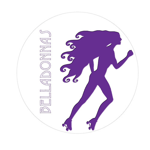
variant 4

and yeah, i know that technically there’s only really two cause they’re just black or white back grounds with the extra text being the only difference, but still. if this was on a button i’d buy it.